
alaska
Repositioning a national fitout leader to reclaim its edge in New Zealand’s competitive construction market.
Repositioning a national fitout leader to reclaim its edge in New Zealand’s competitive construction market.
problem
Alaska Construction & Interiors built their reputation by redefining what a New Zealand construction and fitout company could look like. When they launched in 2006, their clean black vehicles, modern aesthetic and polished approach disrupted an industry known for being rough around the edges. Two decades on, competitors had caught up visually and challenger brands were beginning to outperform them. In a crowded market, they needed to reclaim their leadership position with a brand identity and website that reflected their experience, professionalism and ability to deliver complex, multimillion-dollar projects on time and on budget.
Alaska Construction & Interiors built their reputation by redefining what a New Zealand construction and fitout company could look like. When they launched in 2006, their clean black vehicles, modern aesthetic and polished approach disrupted an industry known for being rough around the edges. Two decades on, competitors had caught up visually and challenger brands were beginning to outperform them. In a crowded market, they needed to reclaim their leadership position with a brand identity and website that reflected their experience, professionalism and ability to deliver complex, multimillion-dollar projects on time and on budget.
When Alaska launched in 2006, they set the standard, but competitors caught up. The challenge was to refresh their brand and website to reclaim a leadership position and reflect their experience delivering high-value projects.
solution
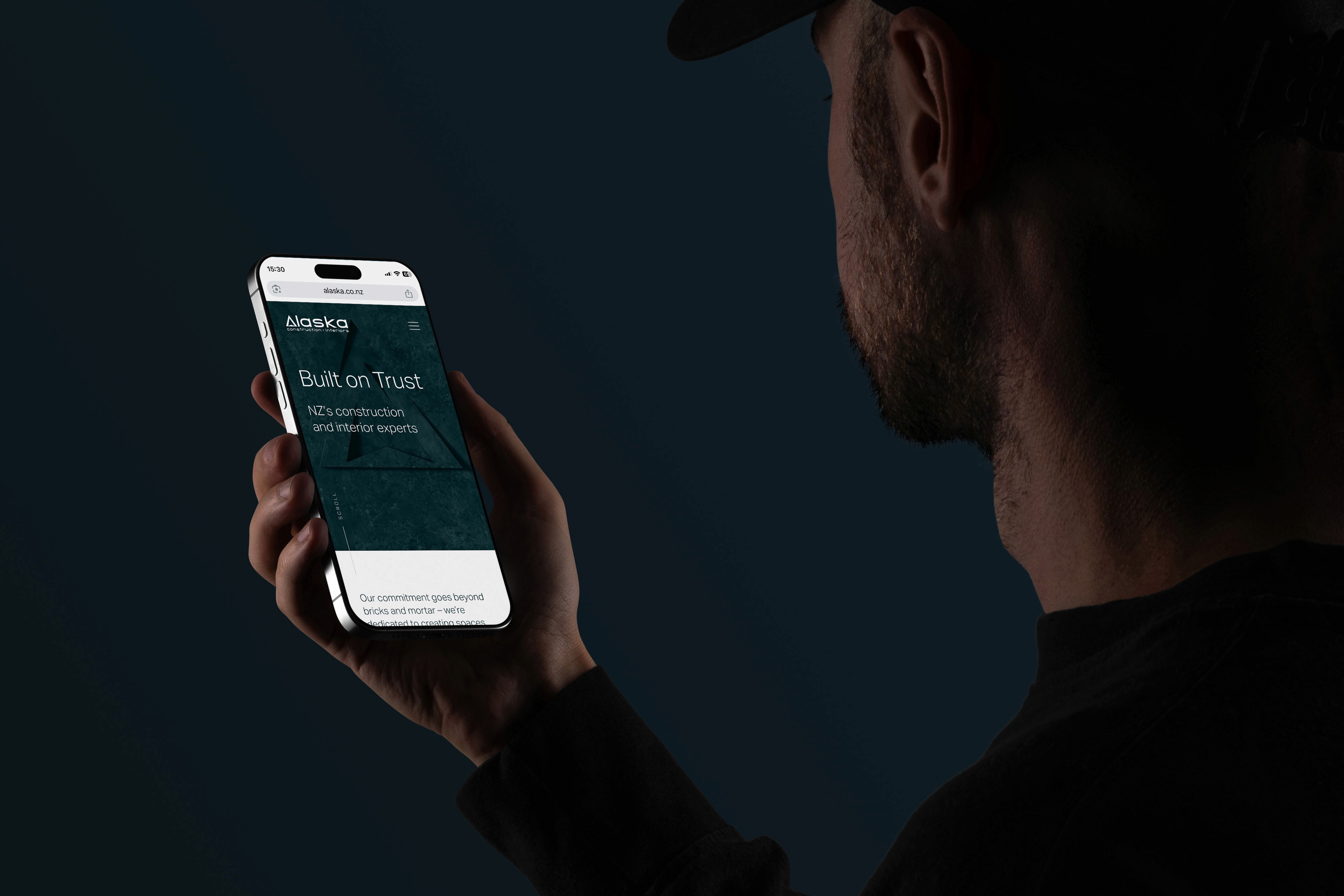
A comprehensive brand strategy and website design process to reposition Alaska for years of future growth. Through a series of national interviews with staff and clients, we uncovered what truly set the business apart: trust that every project will be planned and delivered meticulously, and an honest, human approach to doing business. This insight shaped refreshed brand guidelines, a refined visual system, and the introduction of the endline "Built on Trust". The updated branding was rolled out across new templates, collateral, and a fully redesigned website, creating a cohesive, premium presence across NZ’s construction and interior fitout sector.
A comprehensive brand strategy and website design process to reposition Alaska for years of future growth. Through a series of national interviews with staff and clients, we uncovered what truly set the business apart: trust that every project will be planned and delivered meticulously, and an honest, human approach to doing business. This insight shaped refreshed brand guidelines, a refined visual system, and the introduction of the endline "Built on Trust". The updated branding was rolled out across new templates, collateral, and a fully redesigned website, creating a cohesive, premium presence across NZ’s construction and interior fitout sector.
A full brand and website refresh repositioned Alaska for future growth. Insights from staff and clients shaped a clearer proposition built on trust, leading to refined guidelines, a stronger visual system, and a cohesive rollout across templates, collateral, and a redesigned website.
The refresh wasn’t about reinventing who Alaska were – it was about ensuring their brand and website properly reflected the scale, professionalism and trust they’ve become known for.
Working closely with the management team, we approached the project as more than a visual update. It was about understanding how Alaska could continue setting the pace in a competitive B2B construction environment. The strategy phase unpacked their history of industry disruption and clarified how they wanted to show up in boardrooms, on-site, and online.
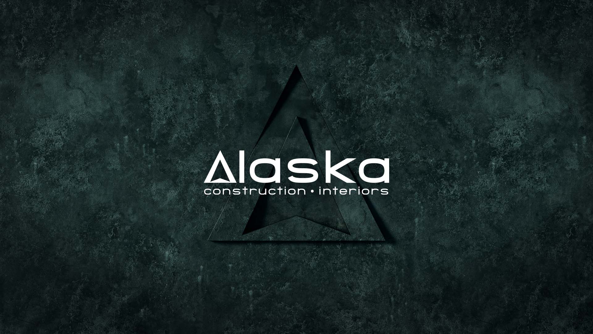
Visually, the brand was designed to feel constructed rather than decorated. A distinctive green stone texture introduced depth and tactility, subtly referencing the materials and finishes central to interior fitout projects. Minimal grid structures brought clarity and order, allowing large-scale project photography to take centre stage without distraction.
To push the identity further, a bespoke 3D green stone animation was developed to bring the logomark to life across digital platforms. The result is a brand and website design that mirrors the spaces Alaska create: structured, refined, and built to last.
The refresh wasn’t about reinventing who Alaska were – it was about ensuring their brand and website properly reflected the scale, professionalism and trust they’ve become known for.
Working closely with the management team, we approached the project as more than a visual update. It was about understanding how Alaska could continue setting the pace in a competitive B2B construction environment. The strategy phase unpacked their history of industry disruption and clarified how they wanted to show up in boardrooms, on-site, and online.
Visually, the brand was designed to feel constructed rather than decorated. A distinctive green stone texture introduced depth and tactility, subtly referencing the materials and finishes central to interior fitout projects. Minimal grid structures brought clarity and order, allowing large-scale project photography to take centre stage without distraction.
To push the identity further, a bespoke 3D green stone animation was developed to bring the logomark to life across digital platforms. The result is a brand and website design that mirrors the spaces Alaska create: structured, refined, and built to last.
The focus wasn’t on reinventing the brand, but bringing it up to match the level the business operates at.
The identity was designed to feel constructed rather than decorated, using minimal grids and a distinctive green stone texture to add depth without distraction. A bespoke 3D animation brought the mark to life in a way that felt tangible, rounding out a brand and website that feel considered, consistent, and built to last.
The result was a more structured, confident brand system built around clarity and restraint.
role
Design Director
tools
Adobe InDesign Adobe Illustrator Adobe Photoshop Adobe XD Adobe After Effects Adobe Premier Pro
category
Branding & Web / UX
01


Website design & development, positioning Alaska as leaders in New Zealand construction and corporate interiors, with a strong emphasis on mobile-first design.
02


A suite of branded templates and collateral built to support tender submissions, large-scale project showcases, and corporate communications.
03


Extending the brand into physical environments, including office and large-scale OOH cladding applications. Making the business looks as premium on-site as it does online.
see also


.say hello
Good design starts with a good conversation. Get in touch.
tom@atomdesign.co.nz
.say hello