
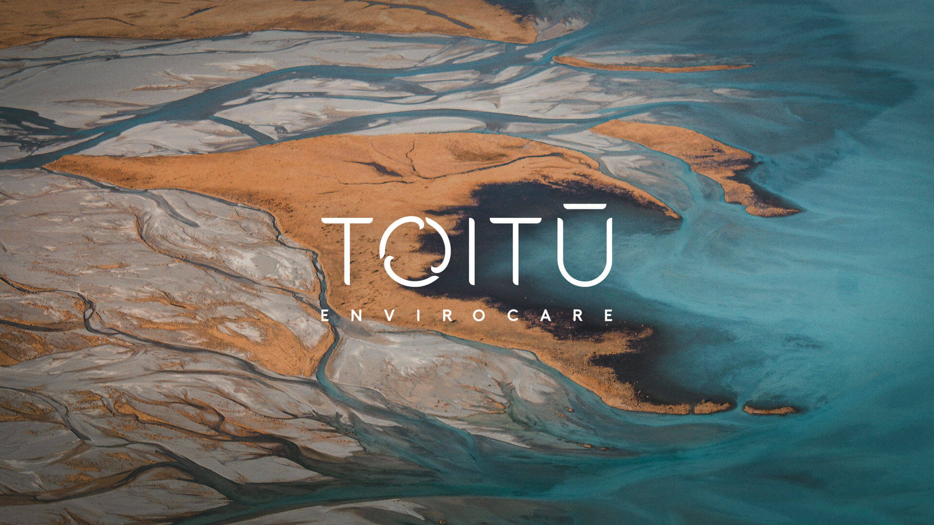
toitū
A sharper brand system for New Zealand’s environmental certification authority.
A sharper brand system for New Zealand’s environmental certification authority.
problem
Toitū had a beautifully crafted identity developed by Designworks (even earning a gold at the 2020 Best Awards), but their internal teams lacked the tools and clarity to use it effectively. Without clear guidance, staff were producing content that looked cluttered, improvised, and off-brand, weakening the organisation’s credibility as a sustainability leader. What should have felt minimal, confident, and environmentally grounded instead often appeared messy and cheap, undermining their messaging and confusing their audience.
Toitū had a beautifully crafted identity developed by Designworks (even earning a gold at the 2020 Best Awards), but their internal teams lacked the tools and clarity to use it effectively. Without clear guidance, staff were producing content that looked cluttered, improvised, and off-brand, weakening the organisation’s credibility as a sustainability leader. What should have felt minimal, confident, and environmentally grounded instead often appeared messy and cheap, undermining their messaging and confusing their audience.
Toitū had a strong brand, but internal teams lacked the tools to use it properly. Content became cluttered and inconsistent, undermining their credibility as a sustainability leader and diluting what should have been a clear, confident identity.
solution
Rather than redesign the identity, we focused on building a cohesive, easy-to-use content system that empowered the Toitū team to express their brand with clarity and consistency. We refined layout structures, created repeatable templates, and set visual rules that reinforced the identity’s modern, scientific simplicity. The result was a set of tools and standards that made good brand execution the default – and poor execution much harder.
Rather than redesign the identity, we focused on building a cohesive, easy-to-use content system that empowered the Toitū team to express their brand with clarity and consistency. We refined layout structures, created repeatable templates, and set visual rules that reinforced the identity’s modern, scientific simplicity. The result was a set of tools and standards that made good brand execution the default – and poor execution much harder.
Rather than redesign the identity, I built a clear, easy-to-use content system that made consistent brand execution the default. Refined layouts, repeatable templates, and simple rules brought clarity and control back to the brand.
Toitū already had a world-class brand, but they lacked the structure needed to bring it to life in everyday communication. The job was to bridge the gap between brand strategy and real-world output, helping their teams produce materials that felt as trustworthy and professional as their sustainability mission.
Work began by reviewing how the brand was being used across reports, presentations, marketing assets, and internal documents. It became clear that the issue wasn’t intent but practicality – staff were doing their best but didn’t have the right tools, templates, or direction. This early audit shaped the strategy: build a system that was simple, intuitive, and aligned with Toitū’s minimal aesthetic.
From there, we developed a suite of structured layouts, modular content patterns, and data-friendly design rules that translated the existing identity into real-world usability. Every decision prioritised clarity and consistency across touchpoints. Through iterative refinement and close collaboration with Toitū’s team, we ensured the system felt natural, flexible, and maintainable.
Once implemented, the impact was immediate. Communications became cleaner and more authoritative, internal outputs improved in quality, and stakeholders responded positively to the strengthened visual clarity. The new system didn’t reinvent the brand – it unlocked its potential, allowing Toitū to communicate with confidence, precision, and the credibility their environmental leadership demands.
role
Design Director
tools
Adobe InDesign Adobe Illustrator Adobe Photoshop Adobe XD PowerPoint
category
Marketing & Content
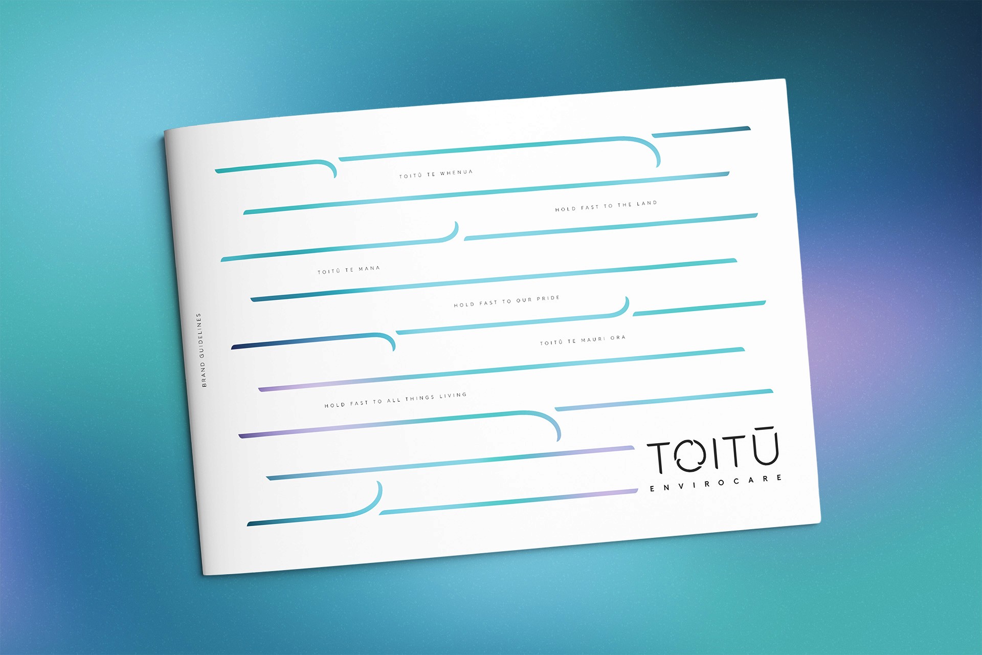
01

Clear, modern framework defining Toitū’s refreshed visual identity and communication guidelines.
02

Sharp, user-focused website showcasing Toitū’s services, and premium positioning.
03


Clean, confident creative celebrating sustainability leaders with bold, uplifting awards visuals.
04


High-impact outdoor visuals delivering strong brand presence across busy public environments.
see also


.say hello
currently accepting projects, get in touch for a quote or to check availability
tom@atomdesign.co.nz
.say hello